
 In an age of hyper marketing, intense competition and tightly controlled PR, it’s amazing that truly horrible ideas can still make it past the brainstorming stage. Whether it’s the nightmare of design by committee or just a conflagration of mediocre talents pulling the wool over the eyes of out of touch rich CEOs, we occasionally see awful designs rolled out in an underwhelming explosion of anticlimax. Today, we analyze the most recent Major League Soccer obscenity in our continuing series: Somebody Approved This.
![]()
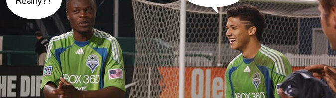
Jersey: The 2012 alternate jersey of Seattle Sounders FC.
Years worn: 2012 – whenever the retinas of every person looking at them have been burned out. We give it until the 18th minute of action in game number one.
Reaction: Numerous, and all humourous:
- Gales of laughter and borderline offensive comments from fans of other clubs. Our own Jason Kurylo tweeted, “The Sounders are riding in a Pride Week cycling race? Good for them!”
- Snippets like this gem from their own supporters: “LA gets awesome black uni’s and we get a friggin Old Navy commercial. We can do better then this.”
- General amusement that the club is branding these as “Super Cyan” trimmed in “Electricity”.
Most famous players to wear it: Good question. Fortunately, class act Kasey Keller retired and won’t even have to be on the same field with these things, but then again, goalkeepers wouldn’t be forced to wear them anyways. I know: who’s that guy in the picture up top? Let’s go with him. Nobody else will as long as he’s dressed in that kit.
 Why it’s great: MLS has really gotten away from its roots. Only Columbus has really AWFUL jerseys anymore, even though plenty of teams are bland. I’m really stretching here, but it sort of harkens back to the Sounders’ NASL days. Retro’s always good, right? Right?
Why it’s garbage: The Sounders front office not only thought it was a good idea to keep alive the “Electric” colour of yesteryear’s third kits, they decided it was necessary to invent a new colour to truly create a monstrosity worthy of Somebody Approved This. At best, “Super Cyan” sounds like the colour scheme in the headquarters of the world’s lamest super hero. At worst, it sounds like the marketing pros threw their hands up in frustration when the higher-ups went with that design. Can’t you just imagine the conversation? “We already have comically ugly jerseys. Let’s just throw the word ‘super’ in there, toss a premium price tag on ’em and see who wants to look like the Denver Nuggets on acid. I mean, the Hallowe’en possibilities alone will generate enough sales to get us through the season.”
Haiku to describe Chris’ feelings when he first saw the Sounders 2012 alternate jersey:
Please let them wear these
when they play in Vancouver.
Comedic gold mine.
Other jerseys we can’t believe somebody approved:
24 Aug 2011 – Somebody Approved This: New York Islanders 2011-12 Third Jersey
24 Nov 2011 – Somebody Approved This: Vancouver Canucks Mid-90s Third Jersey
Outstanding review;
Couldn’t agree more with you.
Seattle sucks ass.
Haiku IS fun.