

In an age of hyper marketing, intense competition and tightly controlled PR, it’s amazing that truly horrible ideas can still make it past the brainstorming stage. Whether it’s the nightmare of design by committee or just the conflagration of mediocre talents pulling the wool over the eyes of rich, out-of-touch CEOs, we occasionally see awful designs rolled out in an underwhelming implosion of gut-wrenching anticlimax. Today, we analyze the Vancouver Canucks first-ever alternate sweater. The recently rereleased Frankenchild of several other ugly jerseys, this salmon-topped nightmare is the third in our series… Somebody Approved This.![]()
![]()
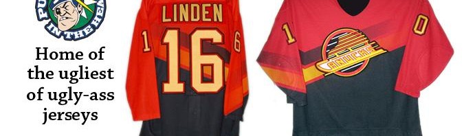
Jersey: The mid-90s third jersey of the Vancouver Canucks.
Years worn: 1995-97.
Reaction: A lot of wretching, ralphing, and theories that corporations, too, have a sense of humour.
Most famous players to wear it: Pavel Bure, Alex Mogilny, Esa Tikkanen, and some guy named Trevor Linden.
Why it’s great: Jason feels so strongly about this jersey being butt-fugly that he just couldn’t come up with any positives. Chris, despite outward appearances of sanity, says “this is not just a sweater, it’s a work of art. The red is more than just a striking colour. It’s meant to represent the salmon, exhausted after its long Stanley Cup finals run and ready to spawn a new generation that will feed the NHL for the next five years. To not have this jersey in your collection is to not truly appreciate the suffering that is Canuck fandom.”
Why it’s garbage: Look, this jersey was so bad it spawned Nickelback. It marries the worst elements of the Hallowe’en costumes that were the Vancouver Canucks Flying Vs (1978-85) and the original downhill skate (1985-89), then tops them off with a bizarre trapezoid of salmon-coloured awfulness. Massive orange and black vees across the mid-section and arms recall the ill-advised 37th facial reconstruction of Carrot Top. That logo, mildly altered from its previous incarnation as a buffalo ranch branding iron, has been called various things, from ‘Star Wars’ to ‘plate of spaghetti’ – jeez, it can’t even inspire a decent mocking epithet! The gravy, if you will: that colour on the shoulders? On the Pantone Colour Wheel (TM), it’s referred to as ‘road crew bile’. Any one part by itself might be tolerable – but when you pull carrots, spaghetti and bile over your head, you can’t help but smell like vomit.
Haiku to describe Jason’s feelings whenever he sees the mid-90s Canucks third jersey:
Forever sickened
Salmon torsos swim upstream
And Tikkanen sucked.
Other jerseys we can’t believe somebody approved:
New York Islanders third jersey (rumoured), 2012
Seattle Sounders third jersey, 2012
5 thoughts on “24 Nov 2011 – Somebody Approved This: Vancouver Canucks Mid-90s Third Jersey”
Comments are closed.